
Making Social Media Accessible
Introduction
Why is it important to make your social media accessible? According to the 2016 census in Ireland, one in seven people have at least one disability. The World Health Organisation’s 2021 research puts that number at 15% of the world population. Now, these statistics are dependent on people disclosing their disability which they may choose not to do for many reasons, so that number may be even higher. That's a huge number of people that could potentially be excluded if you don’t make small changes to your social media presence which this article will cover. If you don’t ensure that your social media is accessible, on top of preventing people from accessing information, it sends the message to people with disabilities that they're not welcome, that they're not wanted in this space and so it’s important to keep empathy in mind. Ultimately we use social media to connect with each other and so we need to make sure everyone can access our information
Design Considerations
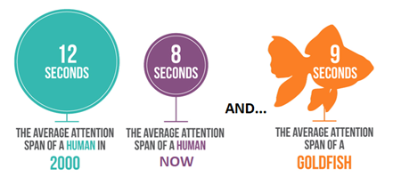
One of the biggest things that I always think about for design, for social media in particular, is font size. The font size should be as big as you can get away with basically. Both because it grabs attention (our attention spans are always getting smaller and smaller) and for legibility, the bigger the font size, the more people are going to be able to access that information. A good rule of thumb is to stick to 12 points and larger.
Another important consideration for accessible design is to avoid using too much text, both to avoid cognitive overload and also because it can interfere with your legibility, because the more text you have, obviously the smaller it's going to have to be. Try to reduce the text that you are using in images and always remember you can link to more information on your website or wherever’s relevant.
The font style you choose will impact the legibility of your text. All font styles fall into two categories which are serif fonts (with little wings or decorative strokes at the edges of each letter) and sans serif fonts (plainer fonts without the extra strokes).

If you use a serif font (such as Times New Roman or Century), the smaller the text is because of those little decorative flourishes the words can appear to blur or bleed into each other which makes it harder to distinguish between letters, so it can create issues for anyone who is colour blind and can't distinguish easily between the font colour and the background colour. For someone with dyslexia, it can exacerbate the words jumbling together. For someone with visual impairments, it can make it harder to read. In the general population as well, small serif fonts like we traditionally get in newspapers are quite difficult for many of us to read. Unless you are using a huge font size and you particularly want to have a mix of fonts, avoid using serif fonts.
It's important to have a high colour contrast between your text and your background colour so that the text stands out enough to be readable. There are many colour checkers available online such as web aim colour checker which allows you to check your colour contrast is sufficient using the hex codes for each colour. If you’re not sure what hex codes are and aren’t familiar with generating appropriate colour combinations, or if your brand guidelines require you use certain colours, a good solution is to drop bars or boxes or any shape on top of your main colour image that's either black or white and use black or white text like I have done in the example below.
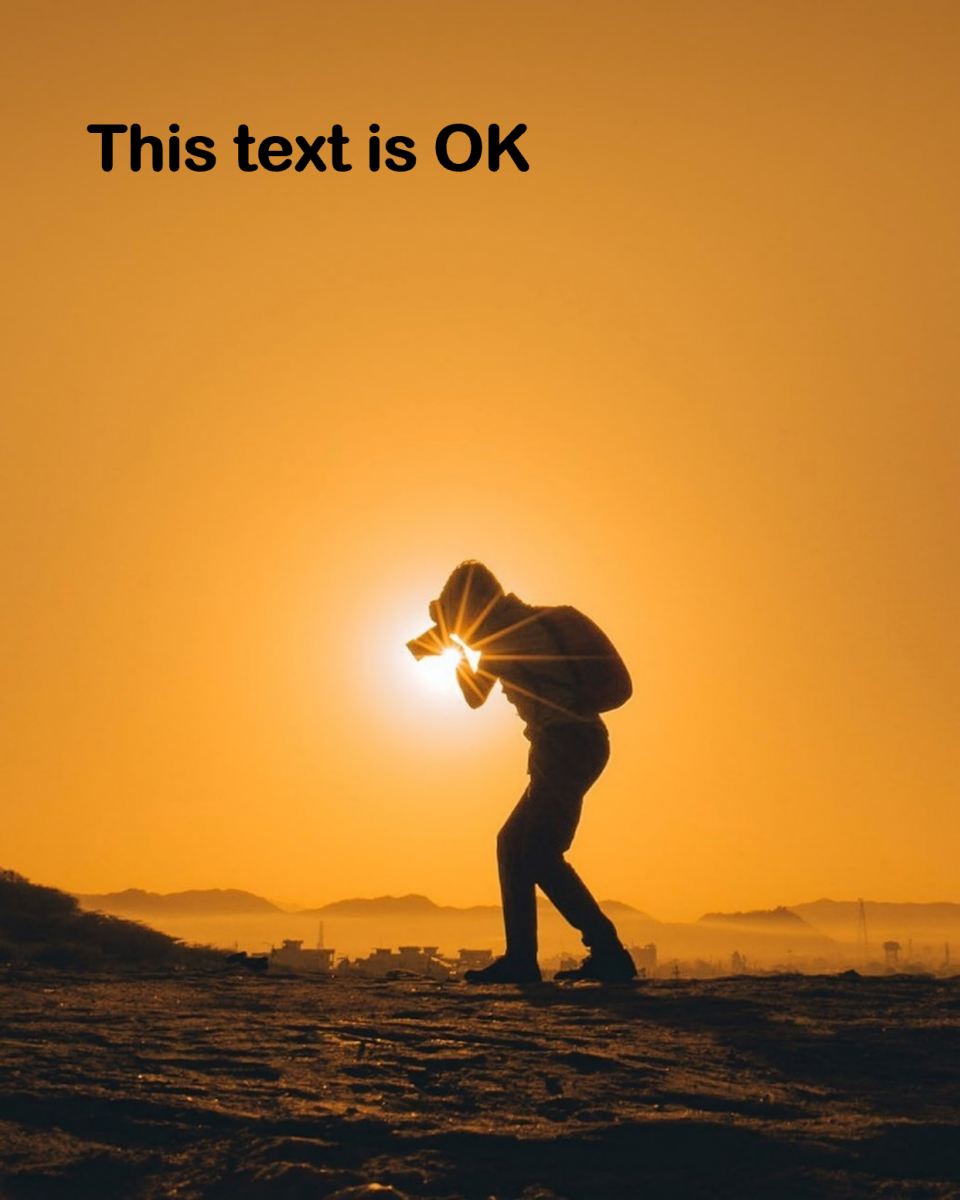
If you are using photography, you need to be careful when including text. Photographs that work well like the example below will have a big wide background that's uninterrupted, both because it's easy to get a good colour contrast between the text and the background colour, but also because there’s enough space that there is nothing interrupting the flow of the text that makes it harder to read.
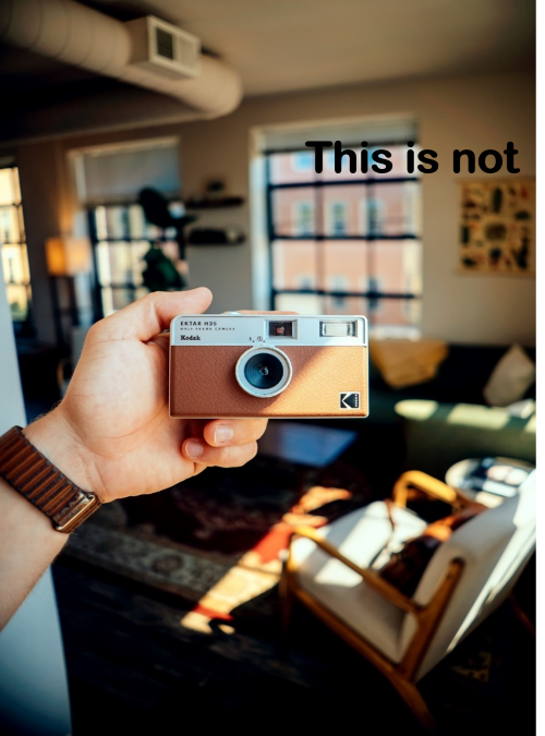
Now in the next example, there is technically a good colour contrast between the colour of the wall on the image and the text colour, but because the text is interrupted by that window most people will struggle to read it. If you have dyslexia, are colour blind or visually impaired you may not be able to access the information at all.
Again, if you do need to use a particular photograph, that might be a group shot or a picture with a building with a busy background, add a square or any other shape that has a sufficient colour contrast with your text.
Key tips: Use as large a font size as you can. Use sans-serif fonts like Calibri or Arial. Make sure there is a high colour contrast between your font colour and background colour (you can use checkers like Web AIM colour contrast checker, or if in doubt use black and white).
Captioning Videos
If you are using videos in any context which have audio information, you need to include captions/subtitles. Now thankfully a lot of the social media platforms actually make that quite easy for you to do, there are ways to auto generate your captions which is really helpful. For videos under 10 minutes which would cover most of our social media videos, Kapwing video editor has an easy-to-use interface that is free to use and is fast and relatively accurate at generating subtitles. It’s always important to look over the captions and correct any errors the website has made.
For videos longer than ten minutes in duration, YouTube works really well but it takes a bit longer than Kapwing to generate subtitles.
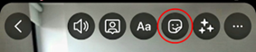
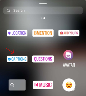
Instagram Stories now have an auto-caption feature which you can use if you’re recording directly on the app. If you click the button indicated below and then select captions, it will generate them really quickly. The captions can be moved around so it’s important to try and place them in an open space on the video so that the text is readable. Think about colour contrast so if your background is quite bright use black text, if it’s quite dark use white text. Click on the captions to change the colour.
Alternative Text Image Descriptions
Alternative text is a description of an image, infographic or any visual media which provides access to information to users with visual impairments or who use screen readers for other reasons such as neurodivergent social media users. The most important consideration to keep in mind when you’re writing alternative text is the context. Think about why you’re using the image and what you are communicating with it; is it just expressing the same information as your post but in a visual way to catch attention? Or does it tell the audience important information that doesn’t appear anywhere else in your post? When I deliver communications training, I’ll often use the funny image below of a camel to keep the audience engaged.

I use this image for 2 reasons; because it helps audiences to remember camel case and because it’s funny and keeps the audience engaged. My alternative text description is therefore ‘A goofy photograph of a camel posing for the camera’. But if a vet was using this image, they might want to include more details in their alternative text like ‘A young female camel with 2 humps displaying friendly behaviour by posing for a photograph’. If a photographer was using the image maybe they’d describe the desert and name the location.
How do you add alternative text on different social media platforms? On Twitter you will see the option to 'add description' underneath your image, on Facebook you need to click edit and then you will see the alt-text option, on LinkedIn the option comes up to ‘add alt-text’ under the image. To add alt-text for Instagram click advanced settings and then ‘Write alt-text'.
The Social Media Post
Now that your designs are done or your videos are captioned and you are ready to post on your social media accounts, there are a few final points to keep in mind. If you are using a hashtag, capitalise the first letter of each new word so that a) people are able to easily distinguish between words and b) anyone using a screen reader will be able to understand the hashtag. This is called camel case because the capital letters are like the humps of a camel #UseCamelCase, see? Be sparing with emojis and try to have them at the start or end of sentences so that they don’t interfere with understanding the post. Check out this example of how social post with too many emojis is experienced via screenreader.
At a glance:
- Use as large a font size as you can. Use sans-serif fonts like Calibri or Arial. Make sure there is a high colour contrast between your font colour and background colour (you can use checkers like Web AIM colour contrast checker, or if in doubt use black and white).
- Caption any videos that contain audio. Avoid making graphic videos that have text only as these aren’t accessible for blind or visually impaired users.
- Provide alt text descriptions for any images, infographics or other visual-led media you use. Think of the context of what you are trying to communicate with the image, and then focus on that for your description.
- Use camel case for hashtags #LikeThis where you are capitalising the first letter of each new word.
- Be sparing with emojis and try to have them at the start or end of sentences so that they don’t interfere with understanding the post.
- Clearly tell the audience where to go for more information whether that means providing an email address or including a link to a webpage.